
Iterative UX & UI Improvements for Two Webflow Sites
UX Designer & Webflow Developer
Multiple assignments
(2024–2025)
UX Overhaul E-commerce site + Marketing Agency site
Webflow
Figma
The client initially approached me to improve specific parts of the e-commerce shop. Alongside this, they asked for broader recommendations on how the sites could be improved.I proposed a page-wide UX audit to move beyond isolated fixes. The audit informed a series of UX, UI, and structural improvements across two existing Webflow sites delivered through multiple short assignments over time.
Too many competing elements and CTAs
Heavy animation distracted from core flows
Important actions were easy to miss
Inconsistent spacing, sizing, and typography
Poor contrast and changing backgrounds
Overlapping or visually competing elements
Key messages buried or repeated
Pages lacked clear prioritization
Oversized copy reduced scannability
Shop was not clearly promoted or featured
Product structure lacked hierarchy and filtering
Core offerings competed with low-priority items
Inconsistent component and class usage
Animations and interactions impacted performance
Builds were harder to maintain and scale
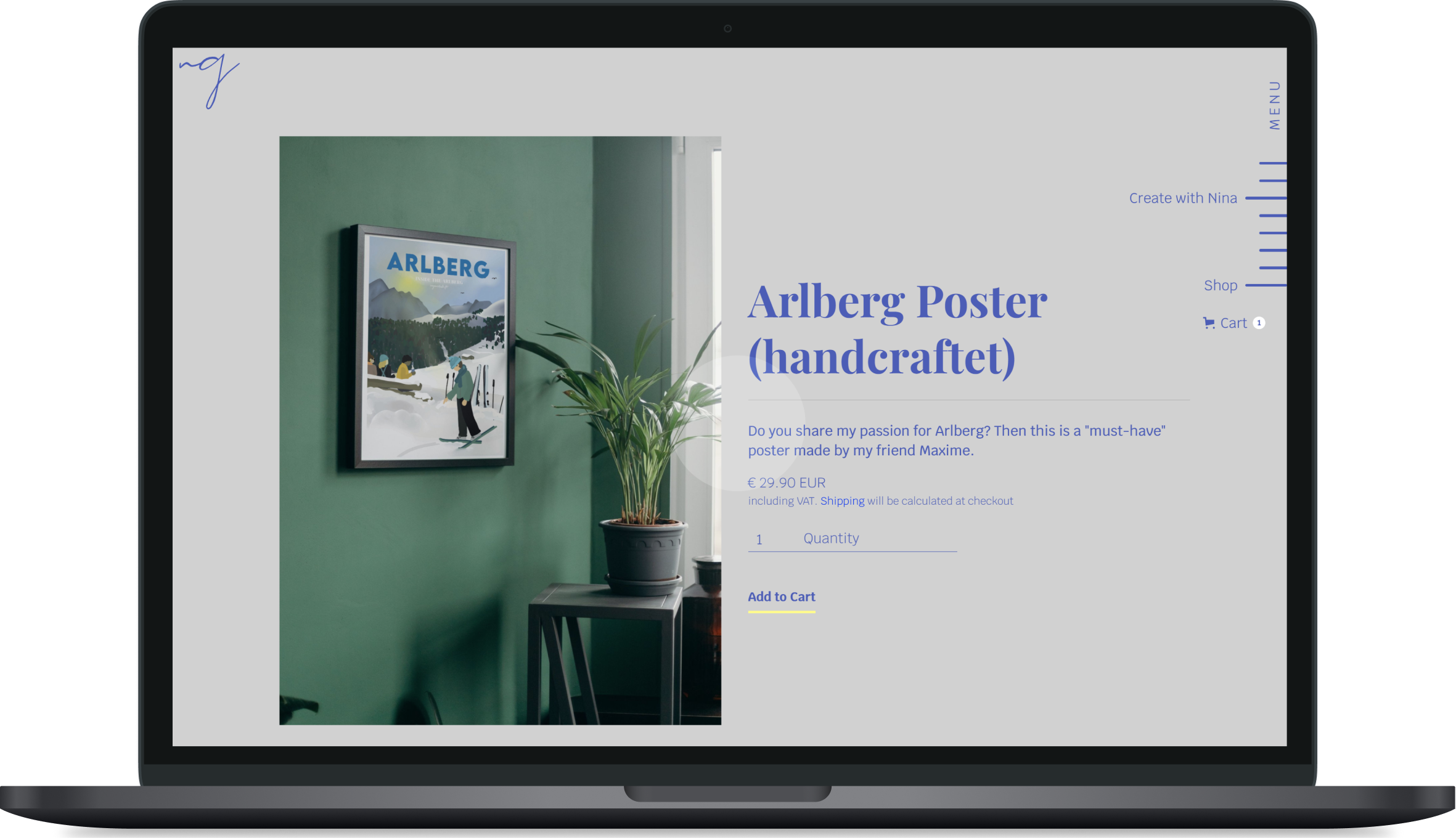
On the e-commerce site, the shop was restructured to be more visible, easier to browse, and better aligned with the site’s core offer. This included layout cleanup, product prioritization, CMS updates for filtering, homepage featuring, and checkout improvements.
On the agency site, the focus was on clarifying the offer and simplifying how services were presented. Content was regrouped, page sections were cleaned up, copy was refined, and contact paths were made more direct through stronger calls to action and scheduling features.
Across both sites, layouts were simplified to reduce visual noise and improve readability. Typography, spacing, contrast, and component consistency were improved, while heavy animation and distracting backgrounds were reduced to create a clearer and more accessible experience.
On the e-commerce site, the shop was restructured to be more visible, easier to browse, and better aligned with the site’s core offer. This included layout cleanup, product prioritization, CMS updates for filtering, homepage featuring, and checkout improvements.

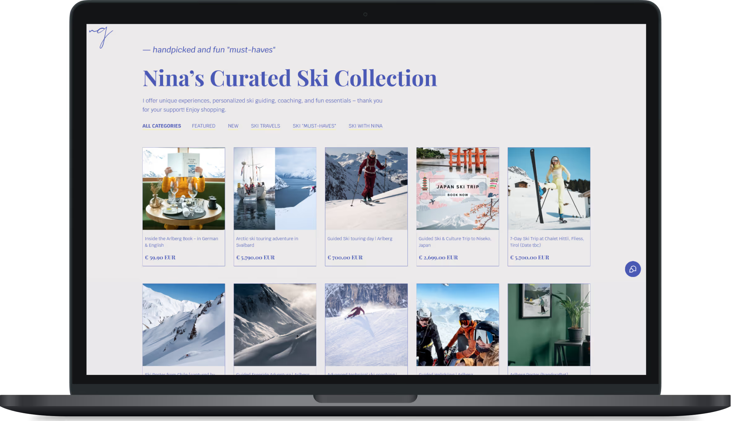


On the agency site, the focus was on clarifying the offer and simplifying how services were presented. Content was regrouped, page sections were cleaned up, copy was refined, and contact paths were made more direct through stronger calls to action and scheduling features.


Across both sites, layouts were simplified to reduce visual noise and improve readability. Typography, spacing, contrast, and component consistency were improved, while heavy animation and distracting backgrounds were reduced to create a clearer and more accessible experience.


One of the applications of my UX/UI design skills manifest itself in designing captivating Web experiences. I facilitate the entire process from branding to design and finally development. To suit my clients needs I became fluent in Webflow development to bring my designs to life. The following projects are examples of websites designed and developed from scratch.


